
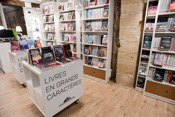
The large-print book, intended for visually impaired readers, still poorly known and isolated in the corners of large cultural areas, will finally benefit from the opening of a bookstore in Paris on Wednesday, the first of its kind.
In the Panthéon district (5th arrondissement), at 6 rue Laplace, the Large Character Bookstore is created by two publishing houses: Voir deprès and A vue d’oeil.
The other publishers will not be there at first. “If our competitors want to join us, we will be delighted to welcome them. Provided that the quality of their catalog is there”, warns Agnès Binsztok, the editorial director.
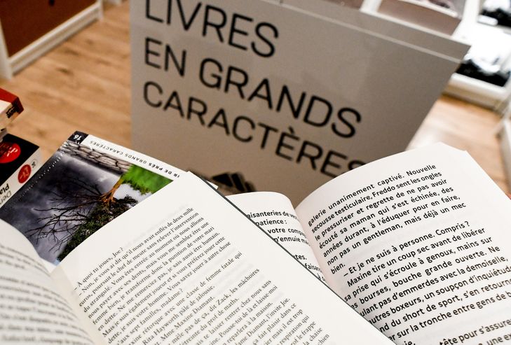
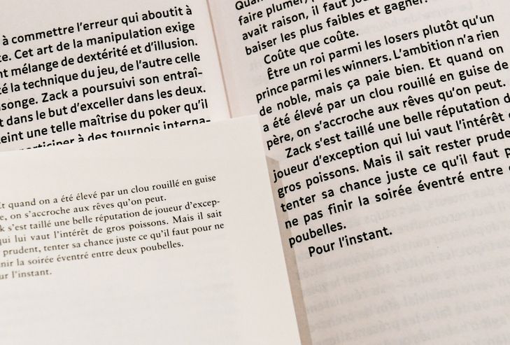
Quality of the texts, but above all of the form. To offer satisfactory reading comfort to the visually impaired, this type of book must meet specific requirements: large and simple characters, spaced lines, and opaque paper with a soft tint, to prevent the reverberation of light, while remaining light.
Readers with other disorders also find their account sometimes: dyslexia, dyspraxia, neurological damage, etc. “I recently learned that the large-print book was helping some people who have had a stroke, and who are in rehabilitation,” says the editor. Or potentially millions of readers.
– Big draw at 900 –
Because they have more pages, and cost more to print, these books are more expensive. One of the successes of recent years, for example, “Le Lambeau” by Philippe Lançon (500 pages) sells for 21 euros at Gallimard, and 8.60 euros in pocket at Folio. At Voir deprès, it climbs to 44 euros, for two volumes and 850 pages in total.
Few readers can afford it. “When I obtained the rights, Gallimard agreed that we only make 400 copies. The success was there, we reprinted 50. These are still small numbers, but it was such an important story that it had to,” concedes Binsztok.
The “large prints” remain below a thousand at the start, the publisher evoking for example “800 to 900 copies for a Marc Levy”, the best-selling French novelist since 2000.
His great rival, Guillaume Musso, is with another publisher based in Le Mans, Libra Diffusio. The latest Amélie Nothomb, “Les Aérostats” (2020), was published by Feryane, which did not adopt the “stick characters” deemed essential by Voir deprès, publisher of the Belgian novelist’s previous novel, “Soif” (2019 ).
– Special typeface –
According to Mathieu Rondeau, designer of these books, the lack of uniformity is a problem. “Typography is the most important thing,” he stresses. “If you use Times, Garamond, which are traditional typographies in publishing”, fine and elegant, “you have something aesthetically very beautiful, but which for the visually impaired poses difficulties”.
He swears by a royalty-free font, created in coordination with visually impaired people: Luciole.
The idea of the bookstore, where the reader can see for himself if the reading comfort suits him, has imposed itself. If the vicissitudes of the 2020 health crisis have postponed the opening, the inauguration will take place, with lighting also designed for the visually impaired, under a soft and uniform light.
Coming to this segment of the large-print book, “I discovered that many people were unaware of its existence, and that the catalog suffered from a received idea, that of elderly readers who wanted local novels”, recalls Agnès Binsztok. “They are not asking for that, of course”.